Something I do recommend doing at the beginning of each new year is review website performance from the prior year. What worked on your website in 2021, and what didn’t? Are there ways you can improve overall user experience and make conversions easier for your user? Of course there are. Web design is an ever changing process, and in my opinion, you should never treat your website as a “set it and forget it” asset in your business
How's your homepage?

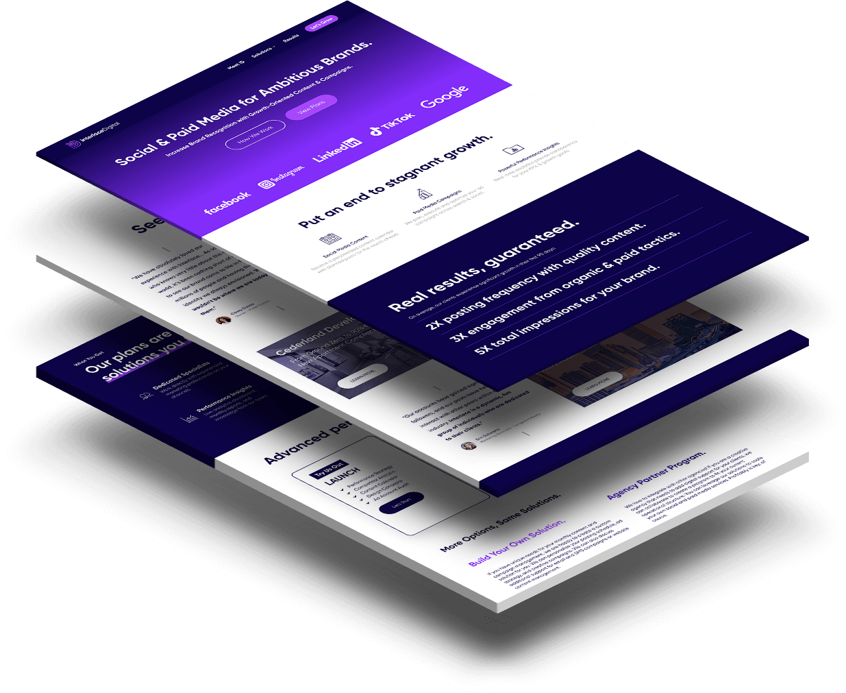
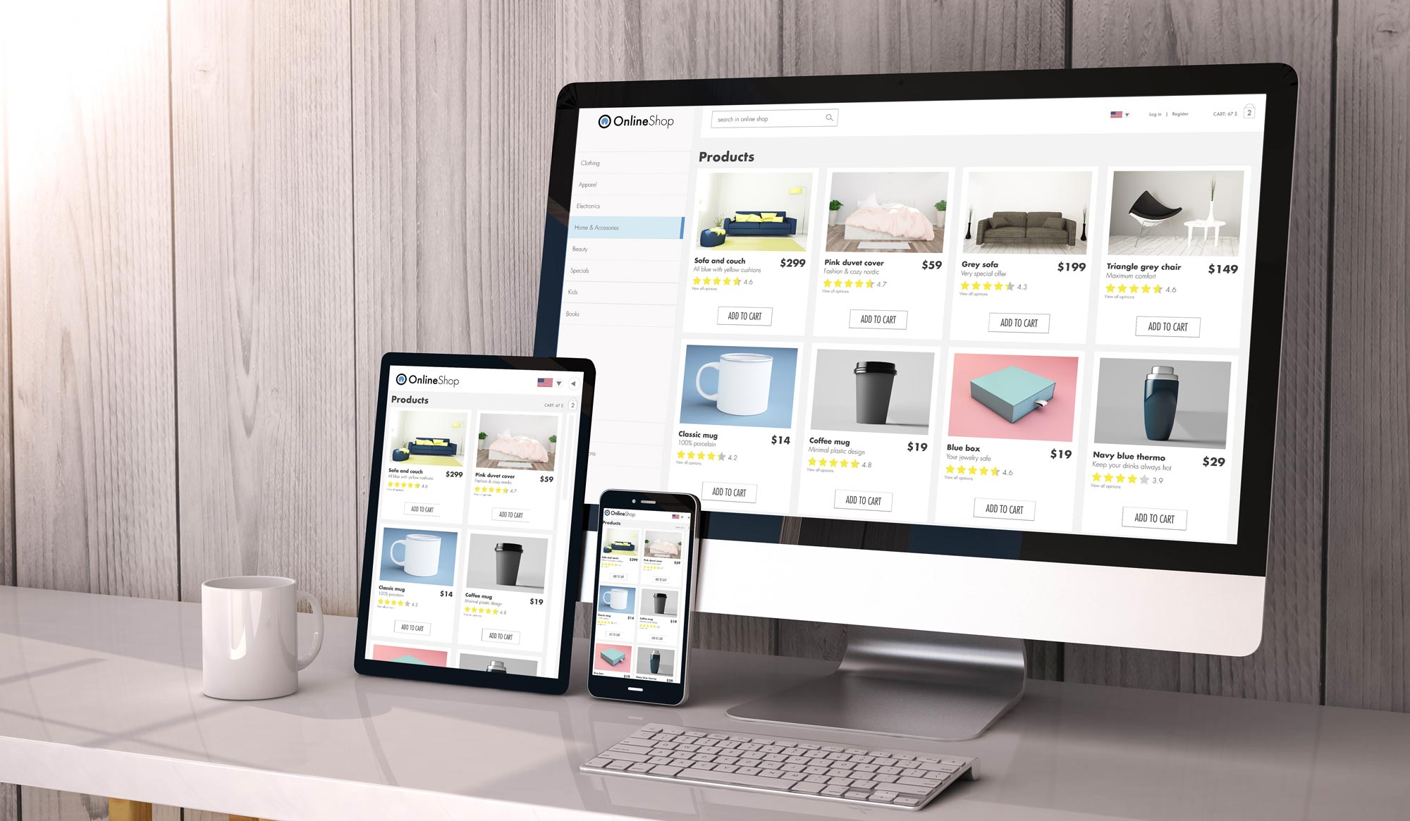
For all websites, the homepage should serve as a teaser for the content that’s available deeper in the sitemap. Typically, my approach is to create content sections specific to each type of internal page we want users to navigate to. Of course, no two websites are built the same, but as a general rule of thumb, think about your site’s content and what the highest priority is. Where is the ideal end of the user journey? For an informational / lead gen website, that might be a contact form embedded on a Service page that collects a user’s information to setup a call or meeting. For an eCommerce website, that means generating product sales. Things to consider…
- Place your highest priority content closer to the top of your homepage, within the first 2-3 content sections. We have to be cognizant of user attention span, which generally decreases year over year. By placing your most important content higher up the page, you give users easy access to what you want them to see the most.
- Don’t over-saturate your homepage with content. Remember what I said about attention span? Keeping your content short, sweet and to the point is another crucial thing to be aware of. If your user is presented with mountains of text on your homepage, the likelihood that they stick around to read it is much lower. Take your time to build condensed, well-written material for the homepage that will lead your user further into the site. Be sure to use relevant imagery / videos to create a more immersive experience.
- Don’t be afraid to test and adjust as necessary! Web design is an ever changing process, and your first design refresh may not get you the results you hope for. Use a tool like Hotjar to gain valuable insight into what parts of your website users interact with most, and what they may be missing or passing over. Data driven decisions are king!

How efficient are your site’s plugins & theme?
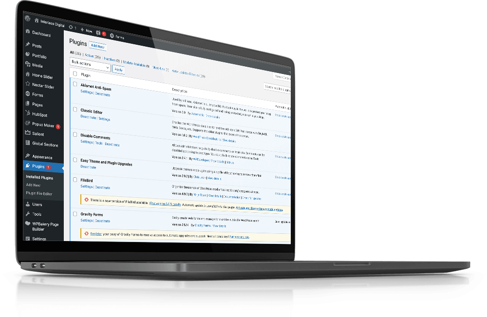
WordPress sites can get… messy. A lot of people don’t realize that plugin bloat is a real thing, and it’s something you should be aware of! On top of that, Media Libraries can get absolutely stacked with files, and it can be tricky to find what you’re looking for. Here are a few powerful plugins and a theme that I recommend every WordPress site uses for optimal efficiency.
- Gravity Forms
- Easily the king of all contact form plugins. Here are my favorite features:
- Drag a drop form builder (no coding required!)
- Conditional logic that allows you to create very advanced forms based on user input
- Easy settings for admin and user notifications
- All form submission records are neatly organized in the back end
- TONS of extensions available for various functionalities
- Easily the king of all contact form plugins. Here are my favorite features:
- FileBird
- I wish I had found this plugin earlier! FileBird is a media library organization plugin that allows you to create folders for your files. This is a MUST for any WordPress site, but especially sites with eCommerce functionality. You’ll never lose track of your media files with this plugin.
- WordFence
- WordFence is what I would call the gold-standard of WordPress security. Even the free license does a great job at keeping your site protected, and allows you to configure the site’s firewall to fend off malicious activity.
- Receive automated notifications direct to your email that include
- Salient WordPress Theme
- I found the Salient theme many years ago, and it is the only theme I use to develop WordPress sites now. There is a long list of reasons why I love this theme, but I’ll list my top 3 here for simplicity sake:
- TONS of built in functionality. The Salient Theme Options are incredibly robust, allowing you to fine tune your site in more ways that you’d imagine. This alone allows me to develop feature-rish WordPress sites with a minimal amount of additional plugins.
- Easily create templates of pages you design in the WPBakery Page Builder. This is a must-have feature for sites that have a large number of pages, or any site that has multiple child pages that contain similar information (like Services pages)
- It’s beautiful. Seriously, the developers behind the Salient theme are true designers at heart. The theme is packed with creative elements, animations, and icons that allow you to beautifully articulate your content to the user.
- BONUS: Salient is well maintained and frequently updated. With every major release version, they find ways to improve on what I would already consider to be the perfect WordPress theme.
- I found the Salient theme many years ago, and it is the only theme I use to develop WordPress sites now. There is a long list of reasons why I love this theme, but I’ll list my top 3 here for simplicity sake:

